In the fiercely competitive landscape of retail shelves and back-bar displays, how does a brand ensure its expression stands out in a sea of glass? Beyond established brand equity and consumer loyalty, the packaging becomes the ultimate silent salesman. It must stop a browsing customer in their tracks and compel a second glance.
So, what packaging element has the power to instantly seize consumer attention? Color is the most visceral and immediate differentiator. Analyzing two decades of SK Glassworks’ portfolio in the mid-to-high-end sector, one consistent truth emerges: over half of these projects employ color application onto transparent glass substrates to amplify shelf appeal and visual magnetism.
The strategic deployment of color in spirit packaging follows distinct category codes and semiotic conventions:
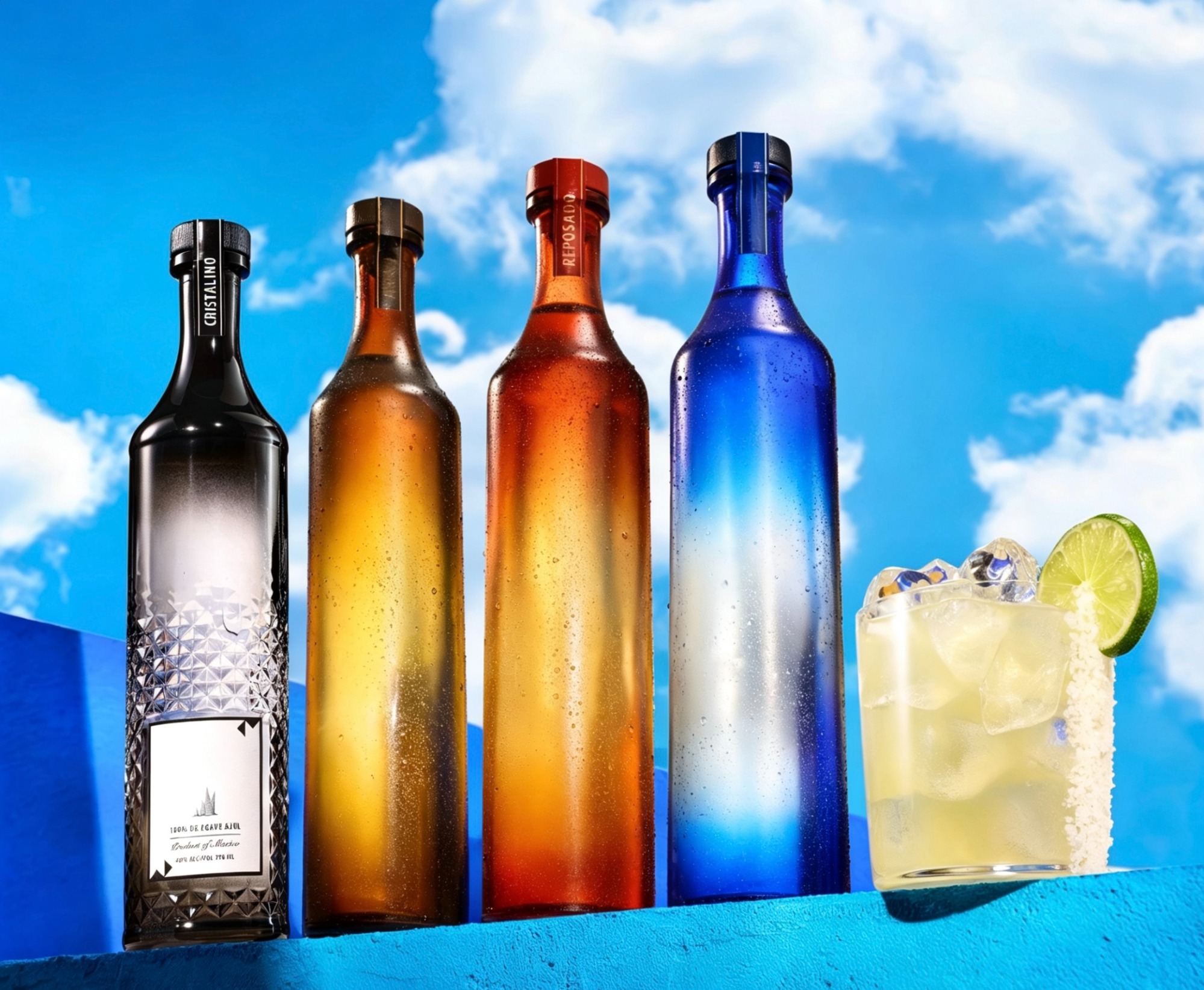
Tequila Portfolio Differentiation: Tequila packaging frequently utilizes a chromatic coding system to visually delineate maturation levels. A crisp, high-gloss clear or lightly tinted bottle traditionally signals Blanco (unaged), a soft, often translucent green or pastel hue denotes Reposado (rested), while a deeper, somber amber or dark tint typically distinguishes Añejo (aged), guiding the consumer intuitively through the range
 Fruit Liqueurs & Infusions:
 These expressions lean heavily into flavor-associative colors. A peach liqueur adopts a warm, blush orange frosted finish, while a raspberry variant employs a deep crimson organic spray coating. This direct visual cue primes the consumer’s palate expectation before the first sip.
Dark Spirits vs. White Spirits: The finishing technique matters as much as the hue. Dark spirits, such as aged rum or brandy, often employ a sophisticated matte varnish or an ultra-matte soft-touch coating, exuding an understated, tactile luxury. Conversely, white spirits—vodkas, gins, or silver tequilas—command attention through high-gloss transparent lacquers, subtle ombre gradients, or bold color-blocking designs, adding depth while preserving the visual of the liquid’s clarity.
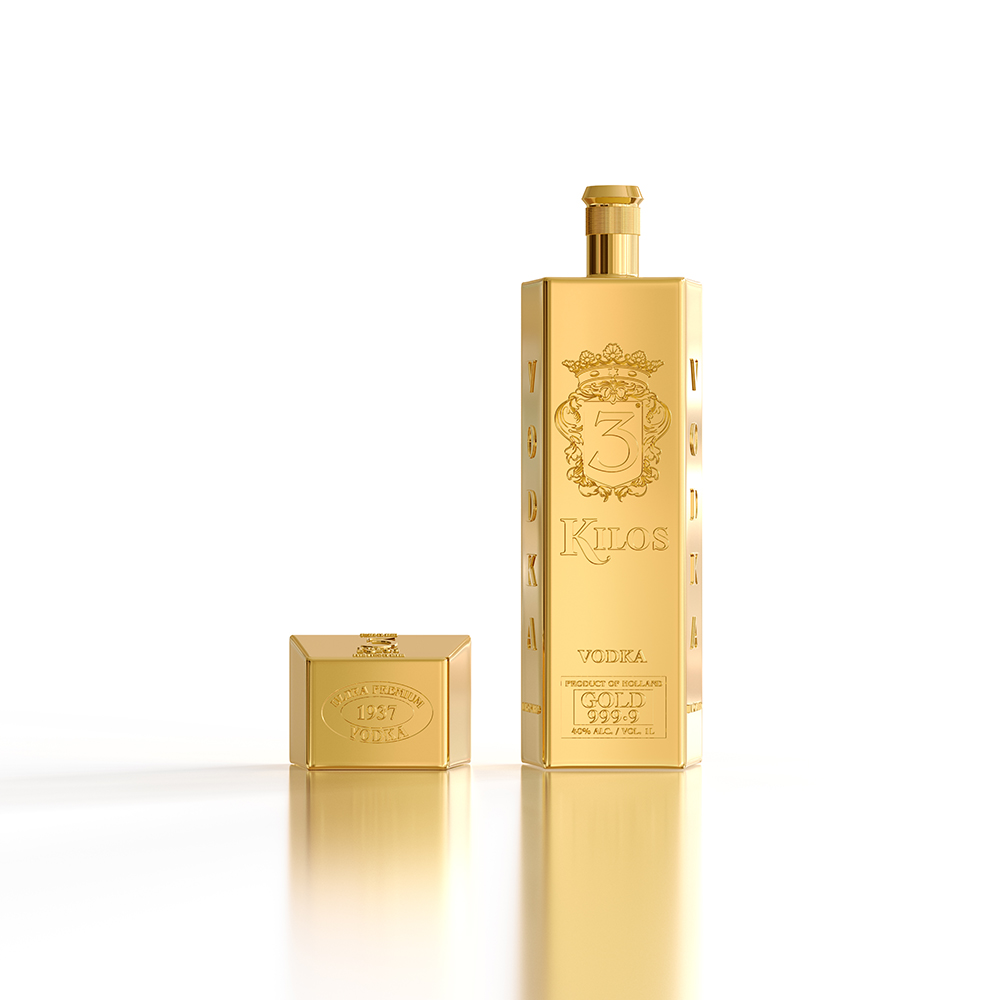
Beyond spray coatings and lacquers, there exists a more definitive hallmark of luxury coloration: gilding and metallization. Since antiquity, gold has signified affluence, status, and the sacred. When a spirit bottle is treated with a full-coverage precious metal luster—whether through electroplating, physical vapor deposition (PVD), or high-adhesion hot-stamping—the result is an object of pure opulence. A fully gilded surface, radiating a mirror-like brilliance, silently but powerfully communicates the brand’s ultra-premium positioning and collectible value, transforming the vessel into a display-worthy heirloom
In the end, the spirit serves as the canvas, and color becomes the illuminating light. A meticulously finished bottle doesn't just contain a fine liquid; it completes it
[Disclaimer: The images inserted in this article are for conceptual and illustrative purposes only, intended to visually represent the packaging techniques and color applications discussed (such as chromatic tequila coding and full-surface gilding). They do not represent any specific commercial product or imply endorsement by the brands or manufacturers depicted. All trademarks, designs, and visual elements remain the property of their respective owners.]
Next Topic: Insights into Premium Spirit Packaging (Ⅲ)– The Art and Function of Labeling & Printing


 Elevating Premium Spirits Packaging (I) – The Clarity of Glass as a Mirror to Liquid Purity
 Cheers to a Shared Future!