Whether ultra-premium or entry-level, every bottle of spirits carries a label that is unmistakably its own.Alabel is far more than an adhesive graphic; it is the embodiment of brand identity, a tactile product narrative, and one of the most decisive factors in visually separating a bottle from its competitors on a crowded back bar or retail shelf.
In the realm of spirits, label design and its material execution constitute arguably the single most critical element of secondary packaging. An inspired label concept immediately elevates perceived value, reinforces brand equity, and captivates the consumer at the critical moment of engagement.
Beyond graphic design, the physical form and printing techniques employed– the way a label is applied, textured, and finished– have become a defining playground for innovation in liquor packaging.
Types of labels
The most traditional is paper label, often made from specialty uncoated stocks such as cotton rag, laid, or felt-marked paper, applied with wet glue. This technique is prized for its vintage authenticity and haptic warmth. Variations include pressure-sensitive labels (self-adhesive labels) , which allow for sophisticated die-cutting, multi-layer constructions, and the use of clear filmic substrates that appear to float on the glass. High-end executions frequently combine these with tactile embellishments: deep debossing, multi-level embossing, hot foil stamping in gold, silver or holographic finishes, and raised spot UV varnish to create contrast between matte absorption and high-gloss reflectivity
For a seamless, permanent union between label and bottle, applied decaling, also known as fired-on labelling,fuses the graphic directly onto the glass surface during annealing. The result is a label that is indelibly part of the bottle itself– impervious to mois e-bucket condensation, and abrasion. A related technique, direct silk-screen printing onto glass using inks, offers a similar glassy, label-less look with vibrant opacity, often seen as the purest expression of form
At the absolute pinnacle of individuality, metal and die-cast plaques– in brass, zinc alloy, pewter, or even sterling silver– are affixed mechanically or with structural adhesives. These serve as permanent crests of craftsmanship, exuding weight, permanence, and unmistakable luxury. Hot-stamped wood veneer, leather appliques, and limited-edition hand-painted elements sign each bottle as a unique and exquisite work of art
How spirits categories dictate label language
Different spirits categories have developed deeply ingrained label conventions, and high-end players often draw on these codes to telegraph authenticity or to disrupt expectations.
Whisky– and particularly single malt Scotch
– exhibits a near-sacred fidelity to the paper label.The paper label, slightly vulnerable to time and damp cellars, paradoxically communicates age, integrity, and living heritage. An old spirit, the logic goes, deserves a label that can age gracefully with it.
Vodka and ultra-premium white spirits gravitate toward the uncluttered purity of decaling and silk-screen printing. This technique champions the liquid itself, creating the illusion that the brand message is intrinsic to the vessel– a powerful statement of modernist minimalism and frost-filtered clarity.
Cognac and Armagnac have long associated their identity with warm metallic embellishment. For marques of exceptional prestige, these paper elements are often completely supplanted by metal badges and plaques– intricately cast, sometimes hand-finished, and applied front and centre as a talisman of rarity and honour.A numbered metal plaque bearing the founder’s insignia transforms the bottle into a collectible heirloom.
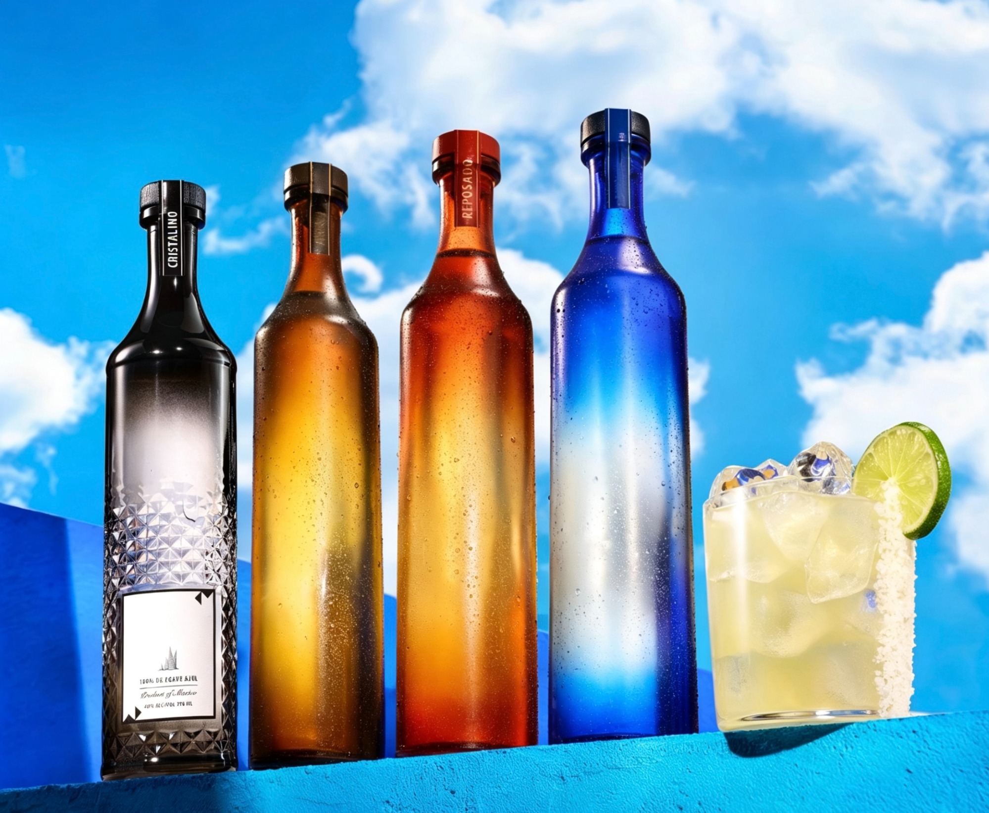
Deluxe liqueurs and prestige tequilas often mix vocabularies, combining hand-applied paper back labels with a prominent metal cameo, or framing a screen-printed glass panel within leather straps and wax-dipped closures.
In every case, the chosen label medium functions as both a mirror of the brand and a quiet definition of the spirit within. It is the first tactile handshake between product and consumer, a promise of the sensory experience to follow. Whether through a softly mottled paper that whispers of a dunnage warehouse, a seamless ceramic ink that gleams with icy precision, or a cold-forged metal shield that speaks of exclusivity, the label remains the most intimate and technically nuanced storyteller in the premium spirits packaging universe.
-- [Image source disclaimer: All images are for illustrative purposes only. Copyrights belong to their respective owners. If you are the copyright holder and object to its use, please contact us for removal.]
Next Topic: Insights into Premium Spirit Packaging (Ⅳ)– Distinction Through Bottle Shap
 Insights into Premium Spirit Packaging (II)– Capturing Attention Through Strategic Color
 Elevating Premium Spirits Packaging (I) – The Clarity of Glass as a Mirror to Liquid Purity
 Cheers to a Shared Future!